At NYIAD we teach our students a simple Three-Step Method for designing every room they create:
- A successful room is functional.
- A successful room expresses a mood.
- A successful room exhibits a sense of harmony.
This simple Three-Step Method is the secret of every interior ever designed. We teach our interior design students to consider these three steps every time they look at a room. You'll find the great home decorating ideas in our Room of the Month series as well as in the design tips on this site helpful in creating outstanding room designs.
When our students mail in their interior design project for analysis by their instructor, the instructor starts by commenting on these three Guidelines. Of course, the instructor analyzes other elements of the project too – decor, layout, furniture, style etc. But the key to good decor – and the essential element of every great interior design – is adherence to these three NYIAD Guidelines.
How do they work? How can you apply them? It's beyond the scope of this Web site to teach you every nuance, but you will get an inkling from the Room of the Month Analysis that follows.
When you think of Mexican design, you may think first of the style for which Mexico was known in the last century: lots tile in bright red, yellow, and blue, painted ceramics and painted wood alebrijas on the shelves, heavy wooden doors, striped blankets.
Today Mexican style means many looks which are each distinctive, and yet each of them is distinctively Mexican as well. For our Room of the Month, we’re going to look at a Mexican home done in a contemporary Mexican style, leaving behind the bright colors for a look that is more subdued, elegant, and tranquil.

This room is an open kitchen/dining/sitting room, adjacent to a larger living room for entertaining. Using the Sheffield Guidelines to Interior Design, let’s look at the function of the room first.

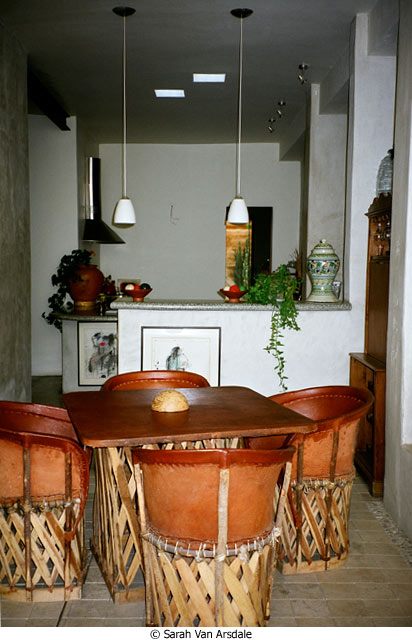
Looking from the dining area into the kitchen, we can see the fan for the stove, and the countertop in the background; this countertop is at just the right height for working, and there is plenty of space for cutting vegetables or making tortillas. The higher countertop blocks the view of the sink and the rest of the kitchen, functioning as a screen so that dinner guests don’t have to look at the mess that’s been made by creating the meal. The twin hanging lamps provide plenty of extra light.
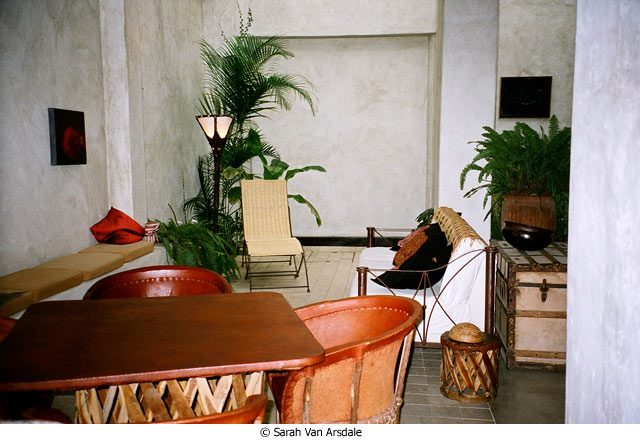
Looking the other way, from the kitchen toward the dining and sitting areas, we see that these too function beautifully. The sitting area allows plenty of room during a large gathering for people to sit on the cushioned bench to the left, or on the chaise, or on the sofa; and if someone is alone, the chaise or sofa provides an ideal reading spot.

The mood here is elegant and slightly formal without being stuffy or stilted. The high ceilings, decorated with a just a few pieces of fine art, and the simplicity of the design of the furnishings, emphasize the stature of the house. But the towering plants, the funky lamp, the bare floors, keep the mood casual enough so that a visitor feels entirely comfortable.
Finally, the harmony here is magnificent. The colors all play off each other, in the neutral tones of the walls, floor, furniture and fabrics. The materials used here all work with each other, rather than against each other — from the woven chaise to the skin table and chairs, from the heavy cotton on the sofa to the rough stone of the walls. The bright green of the plants adds a splash of color that pulls the look together.
This room illustrates how we can bring in elements of international design in ways that are fresh, contemporary, and elegant.


