Have you ever wondered what impression your visitors get when they first step into your home? Thinking beyond the importance of landscape design and exterior curb appeal, one of the most common mistakes we see homeowners make when trying to design a beautiful space is to accidentally overlook the importance of the entryway- which is somewhat understandable. When we spend too much time focusing on the design scheme of some key individual rooms like the kitchen, bedroom and family room, it can be easy to overlook the importance of adding some aesthetic appeal to the hallways and smaller spaces in between.
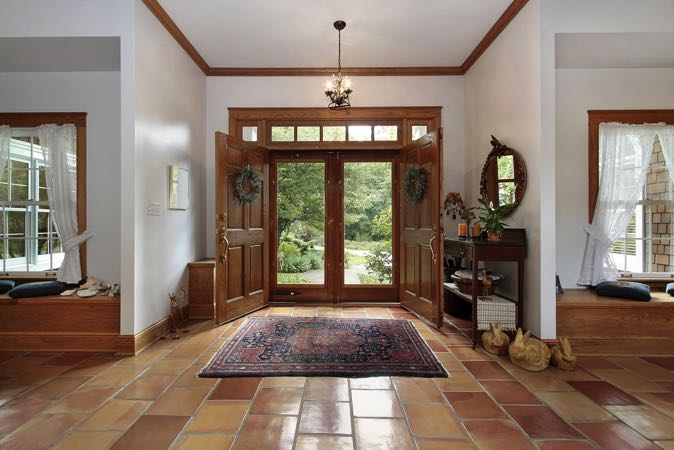
Getting started, let’s take a look at your home’s entryway and see where there’s room for improvement. Just as we would apply to any other space within a home, it’s important to execute those key elements of professional design- visual balance, proportion, color basics and object weight. So first ask yourself: Is this space balanced? If you keep any furniture like benches, small tables or storage pieces in your entry way, it’s important to make sure that these pieces are well balanced if there are more than one. In any space within your home, the heights of all major objects should be appropriately varied. So if you have two taller tables and a lower bench in your entry space, separate the two taller pieces a bit and put the lower piece in the middle to spread out the height and create more appealing equilibrium. Otherwise, the two taller objects directly side by side can appear too overwhelming and sloppy.
Want to start your own interior design business? Click here to browse our course curriculum and learn how you can get started today.
Next- are the colors varied throughout this space? Just like putting two visually heavy pieces of tall furniture side by side can disrupt the look of balance in your home, styling a number of colorful pieces all in one place can do the same. In professional interior design, color is actually considered to have its own sense of heavy visual weight in the same way a sizeable piece of furniture can. So for example, a bright red accent painting hung on the wall could be considered just as heavy as the console table beneath it. So if your space has some colorful accents in it as well, spread them out to achieve the most appealing look.
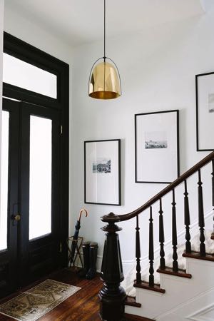
If your space is already balanced, but you’re looking to give your entry an added pop of excitement that it’s currently lacking altogether, there are plenty of simple and inexpensive ways you can do so. For one, if you don’t have much wall space to work with (in terms of hanging artwork), you could add that same artistic pop of intrigue by updating your light fixture with something more exciting and intricate- even a small chandelier could work.
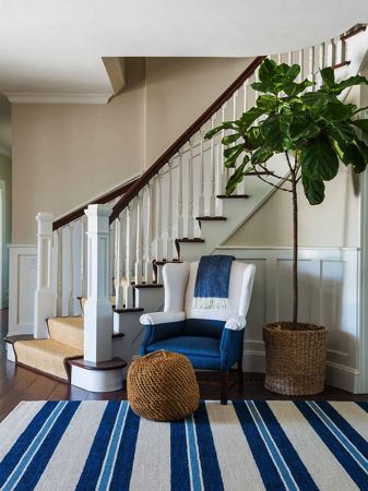
Want to go lower? Again, if you don’t have a lot of wall space to work with but you’re not interested in adding a funky light fixture, you could lay out a colorful area rug along the hallway floor. If you choose something long and thin enough that there’s some space between it and the walls on either side, you’ll also help to make the space appear roomier.
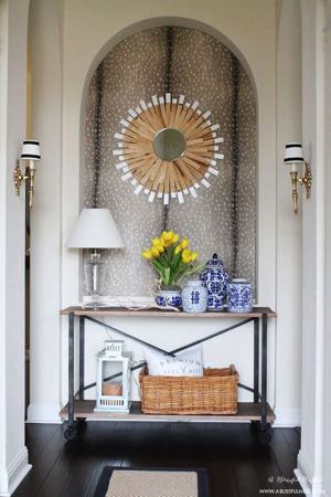
Finally, if you have a small console table in your entryway that tends to function as a family catch-all (as many of these entry tables eventually tend to do), you should absolutely consider investing in some pretty containers to use instead. If you get a set of bold, matching canisters with lids, everyone in your home can have their own dedicated container for storing keys, spare change, packs of gum, etc. Not only will an arrangement of pretty containers add some visual interest to your tablescape, it will also effectively eliminate the common eyesore of junk laying around the home.


